Category: AE 306 Portfolio

Project 2: Abstracted Space Painting

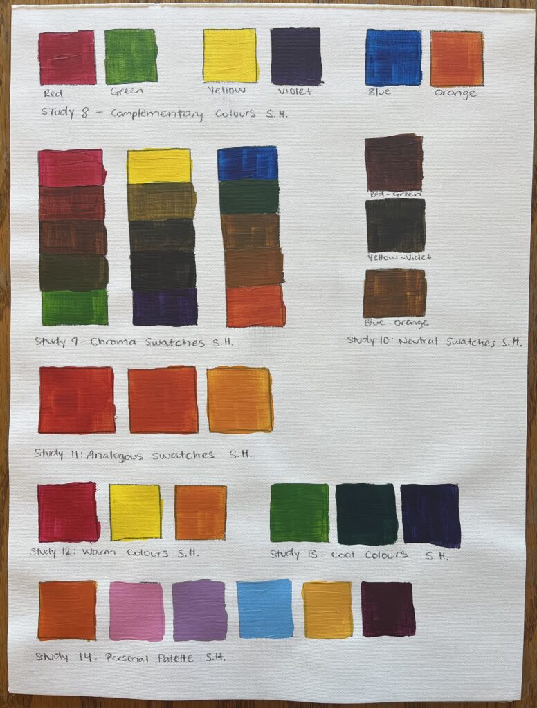
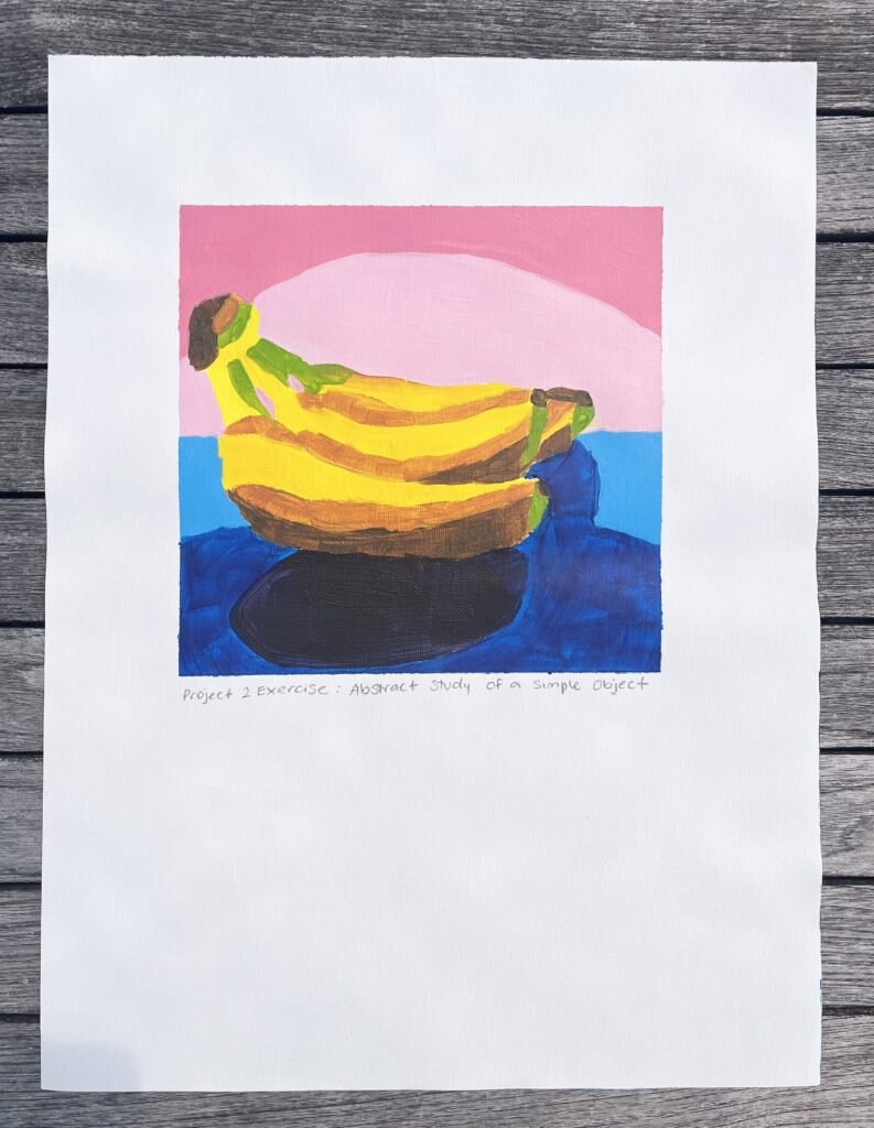
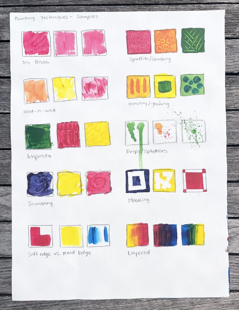
Exercises on Abstraction

Abstract Study of a Simple Object
Samples of Acrylic Painting Techniques

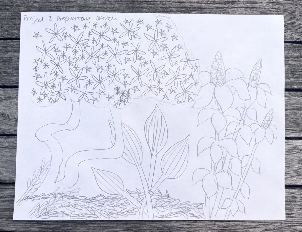
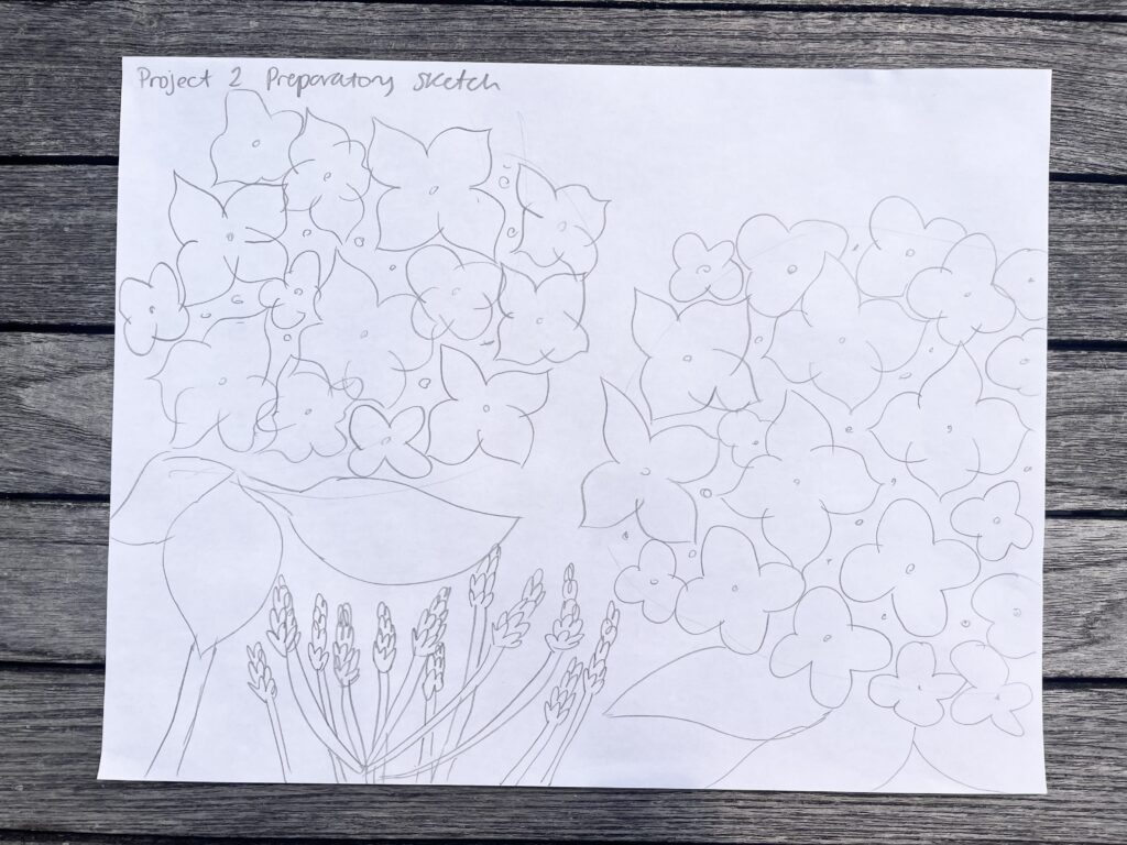
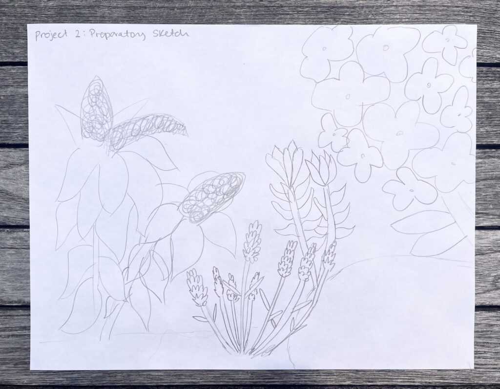
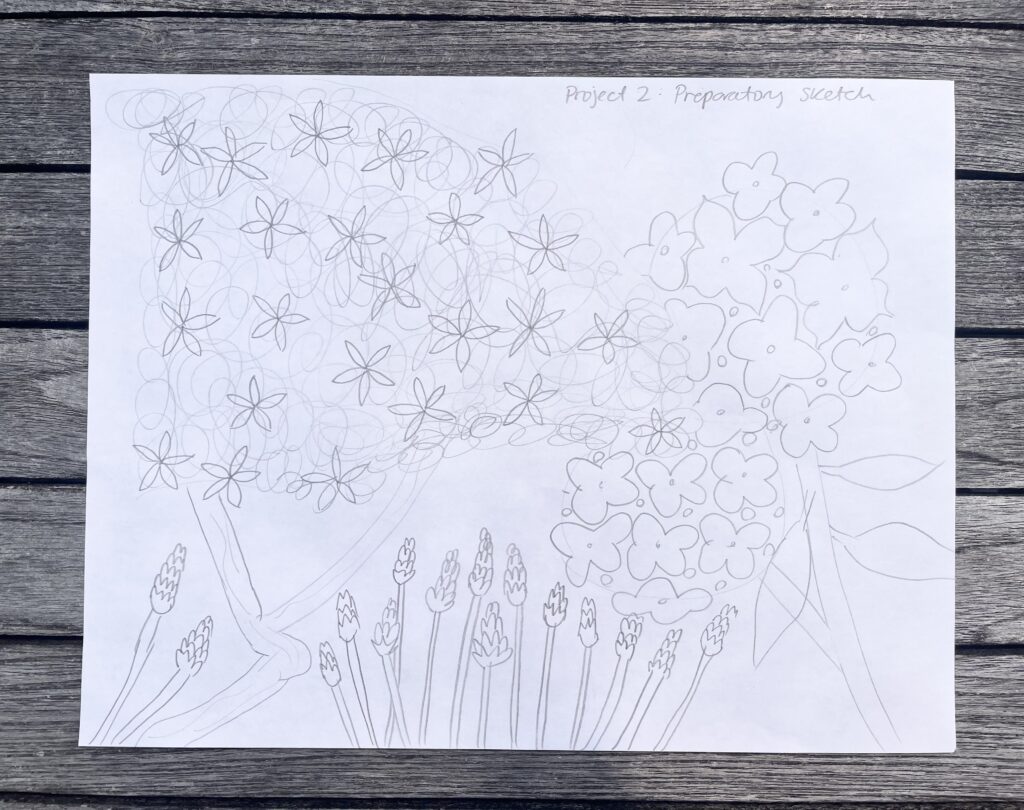
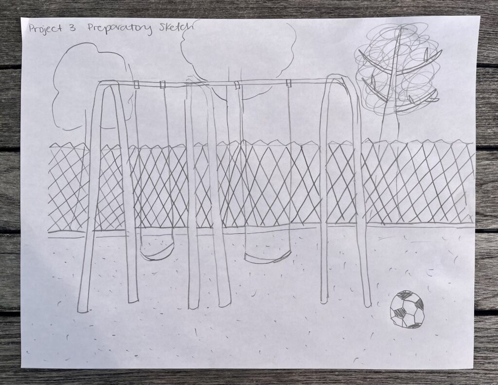
Composition Sketches

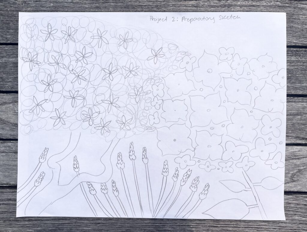
My final sketch and chosen composition

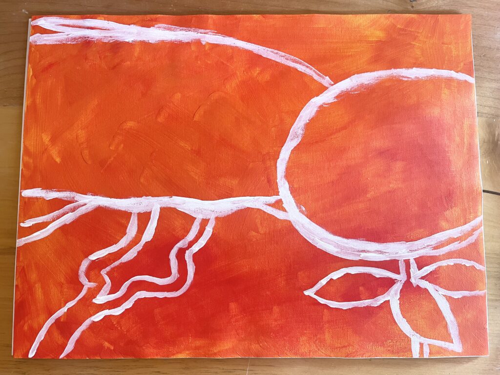
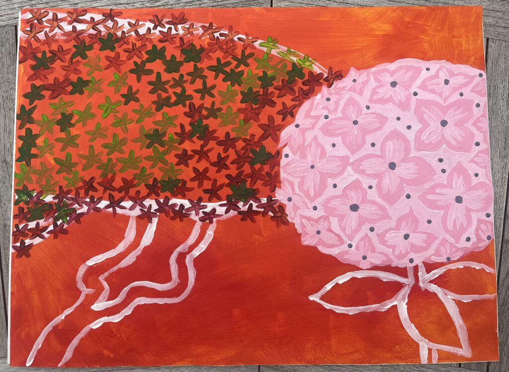
Progress Pictures

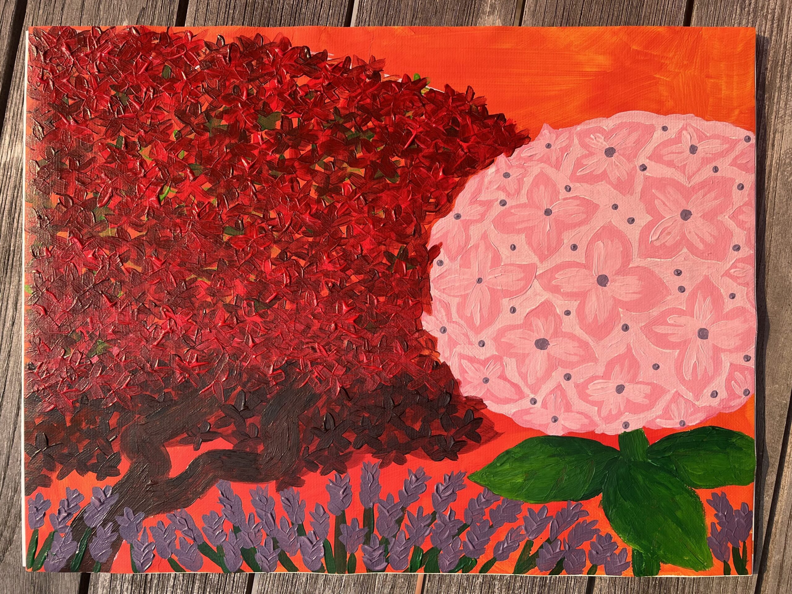
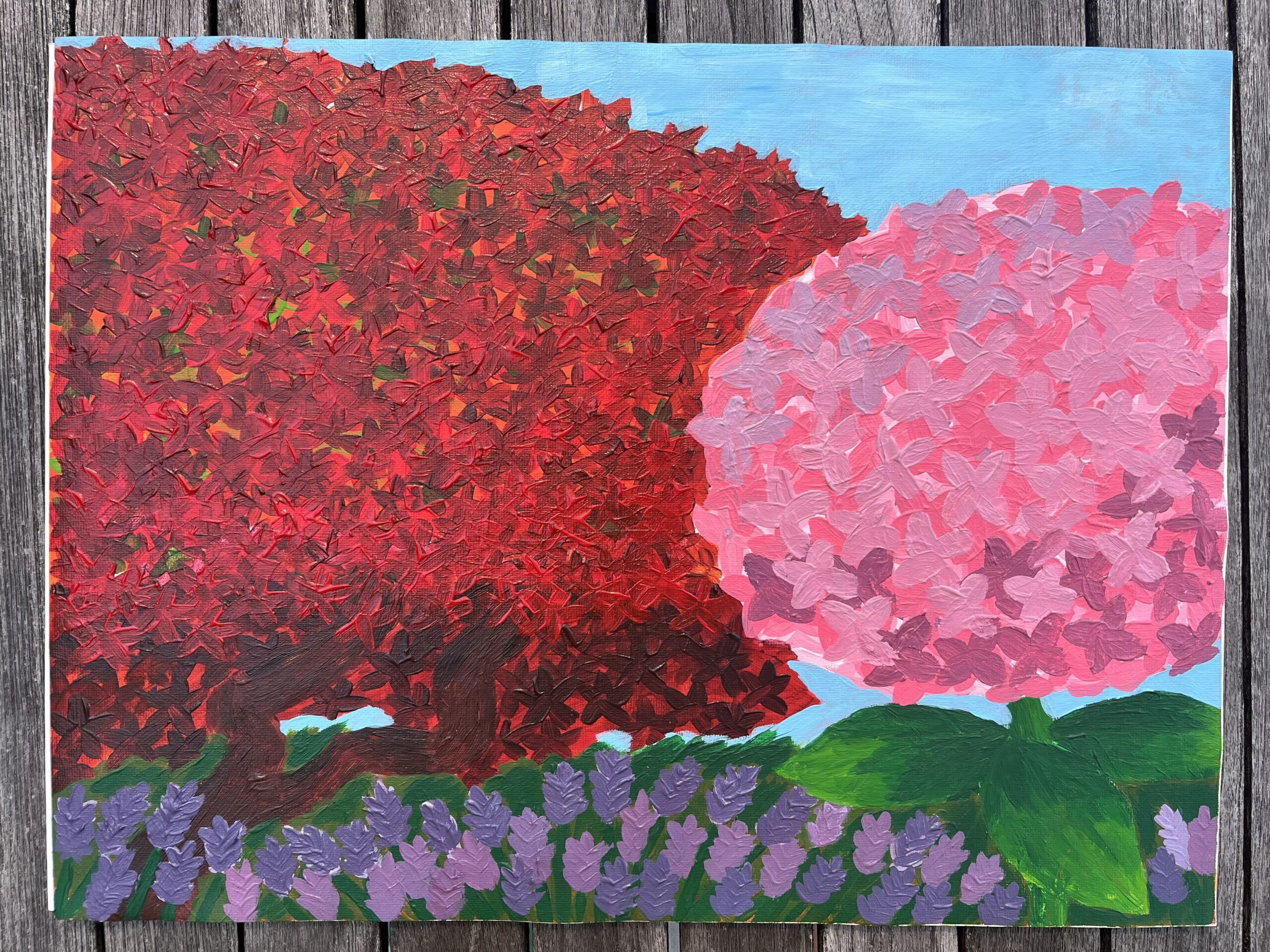
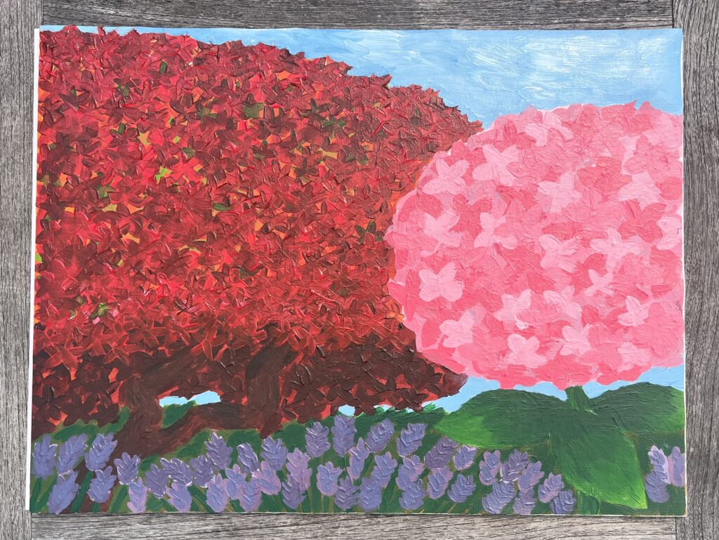
My Finished Painting

Acrylic Paint, 12″x16″ Canvas Pad

My Rationale

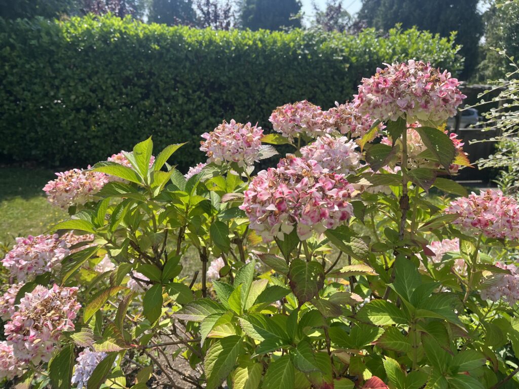
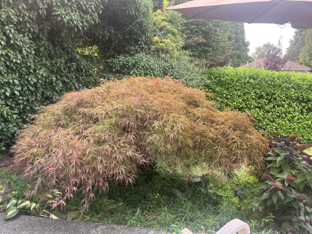
For this abstract painting project, I chose to paint my family’s front garden. For my composition, I included our Japanese maple tree, a hydrangea, and a lavender bush. I have spent so much time outside in the garden, and it has become an important place for me. The plants and tree that I chose to include are focal points of mine when I look out into the garden. For this painting, I wanted to focus on bright colours, as well as texture through layering.

I originally thought that the abstract art style referred to what I now know is non-objective art. I often thought of compositions with bright shapes and sharp lines that didn’t resemble realistic scenes, but evoked feelings nonetheless. I now appreciate that abstract art exists on a continuum and that there are many different ways to use abstraction in painting. Two pieces that I really like from the PowerPoint on Image Development Strategies are La Tristesse du Roi by Henri Matisse and Gauguin Tahiti and Picnic by Paul Gauguin. What I find interesting about these two pieces is the simplified shapes and bright colours used. Another style that I love is that of Abstract Impressionism. I learned that this style is characterized by its use of looser, smaller brushstrokes and an emphasis on form rather than realistic depictions.

One challenge for me while working on this painting was creating form while also focusing on the shapes and colours in my painting. I wish that I had added more depth and form to the hydrangea, especially. I wanted to keep the colours bright, but that meant that I wasn’t able to give as much attention to the form of the plants and tree. I started by painting the hydrangea in more of a simplified style with distinct shapes and colours. I liked the way it turned out, but as I started painting the tree, I realized that the two styles didn’t match. I ended up going in a different direction with the tree because I wanted to create layering to showcase the beautiful mix of greens and reds in the tree. Because I loved the way the tree turned out, I decided to redo the hydrangea. I painted on more layers of various pinks. I really liked how the layering turned out on both the hydrangea and the tree, but if I were to do something differently, I would also add more layers to the lavender bush and the vegetation under the tree.

Final Thoughts

Overall, I enjoyed exploring abstract painting techniques because I felt that I had more freedom to take liberties with the composition and colours of my subject. I also tend to gravitate more to abstract art, so I liked having the opportunity to paint one of my own!

Project 3: Thematic Painting

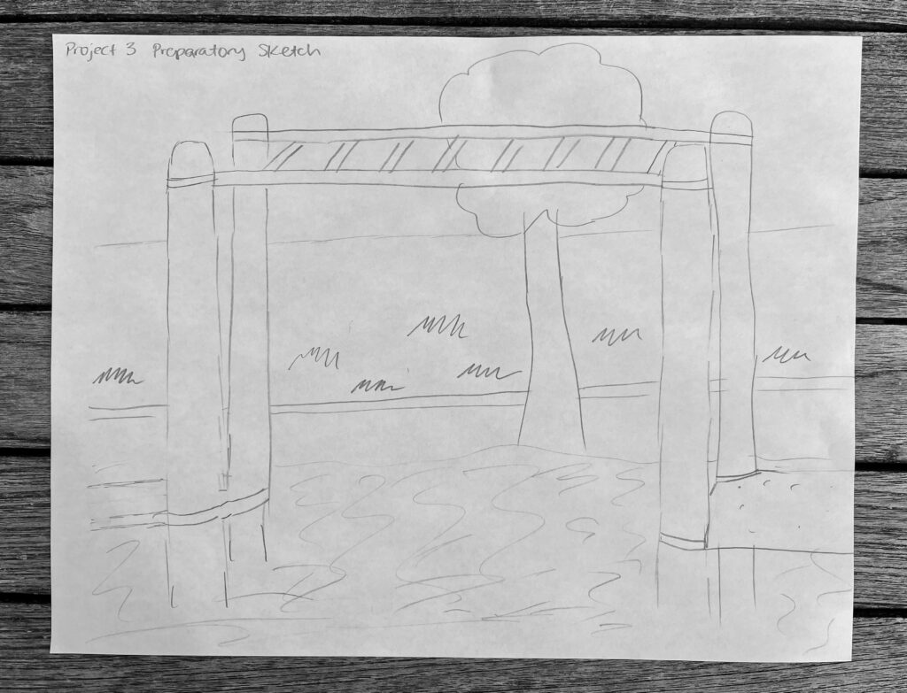
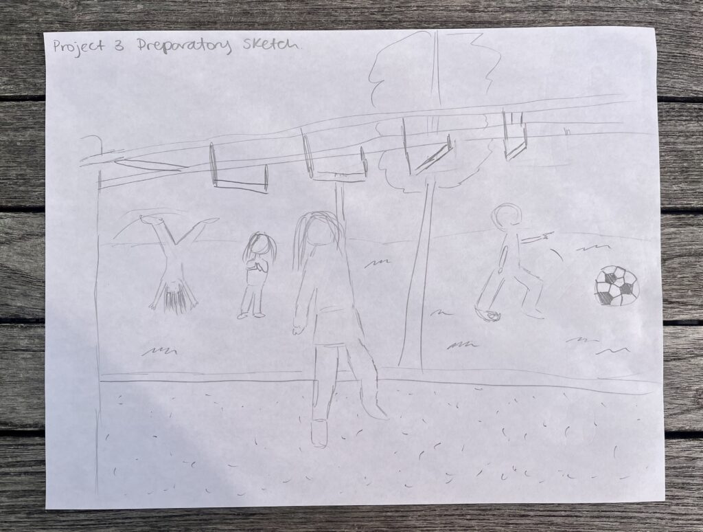
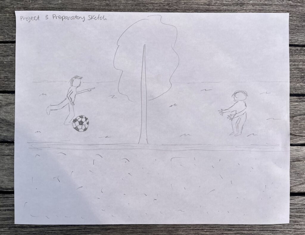
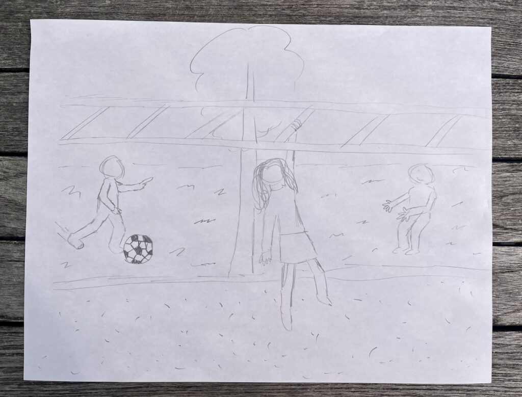
Concept Development

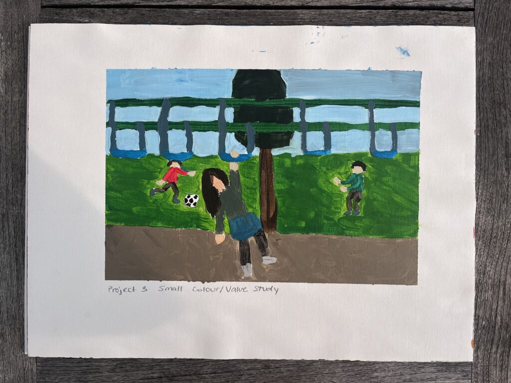
Project 3 Small Basic Colour Value Study

Progress Pictures

My Final Painting
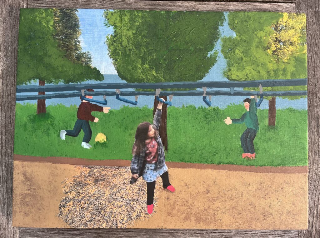
Painted on a 12″x16″ Canvas

My Written Rationale

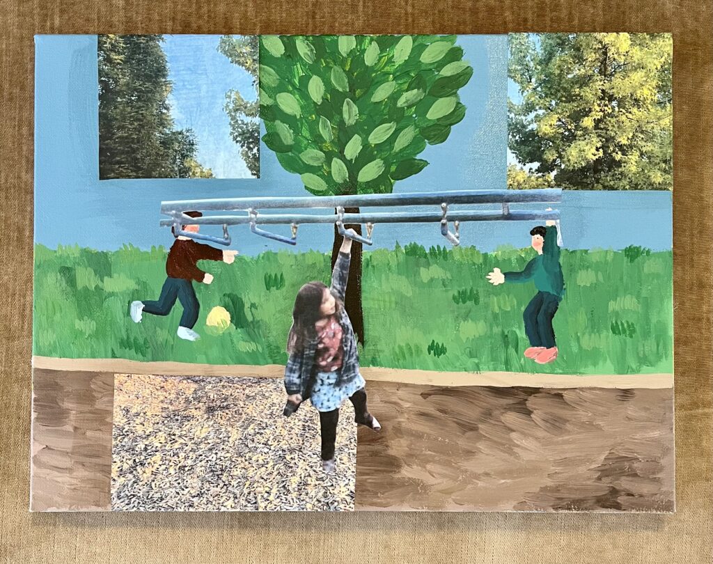
For this final project, I chose to explore the Space and Place theme. I was drawn to this theme because, as I spend time in the neighbourhood I grew up in, I’m constantly confronted with happy memories and how my life has changed. These changes are not always bad, but they make me very sentimental about the little person I used to be and what was special to me. The place that I chose to capture is the playground at my old elementary school, a few blocks away from my family’s home. Even before I was a student, I spent a lot of time playing there before and after school, waiting for my brothers. My favourite thing on the playground was the monkey bars. I spent so much time perfecting my routine and trying out the different types and heights. In all, the playground is a special place to me because of the times that I spent there conquering a challenge, and because of the school. Everything on the school grounds reminds me of the magic I felt as a young student wandering the halls and playing outside.

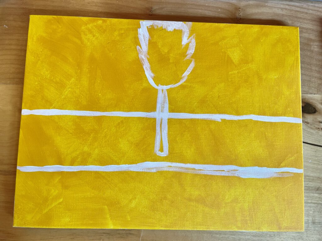
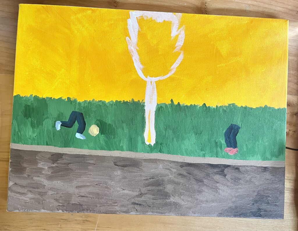
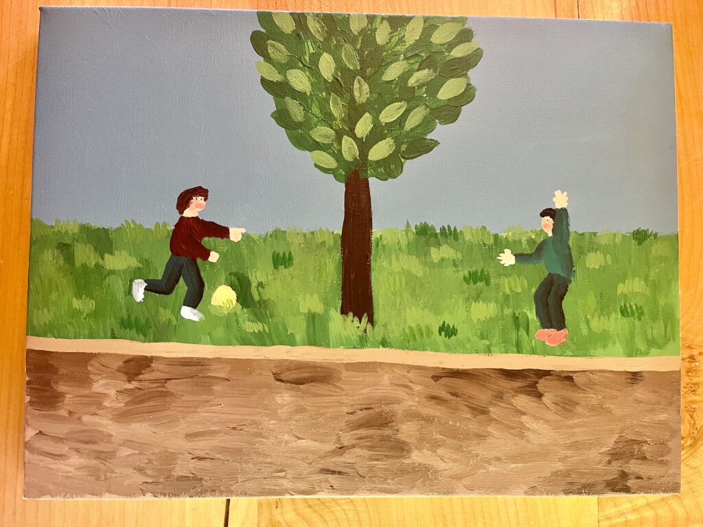
The main idea/feeling I wanted to convey was the nostalgia I feel, along with the sense of change that comes with growing up. My inspiration came from the two images below. One is of myself on the monkey bars when I was little, and the other is a picture that I took of the same place last week. Using acrylic paint and collage as my mediums, I painted the scene as I remembered it, with lush green grass and full trees; then I pasted fragments of its present state. I then used paint to match up the composition and colours. Finally, I added a cutout of my young self on the monkey bars going from one side to the other. I loved using collage as a technique for this project because I think it added a great sense of depth and intrigue to the composition. It also worked well as an amplifier for my chosen idea of change and nostalgia.
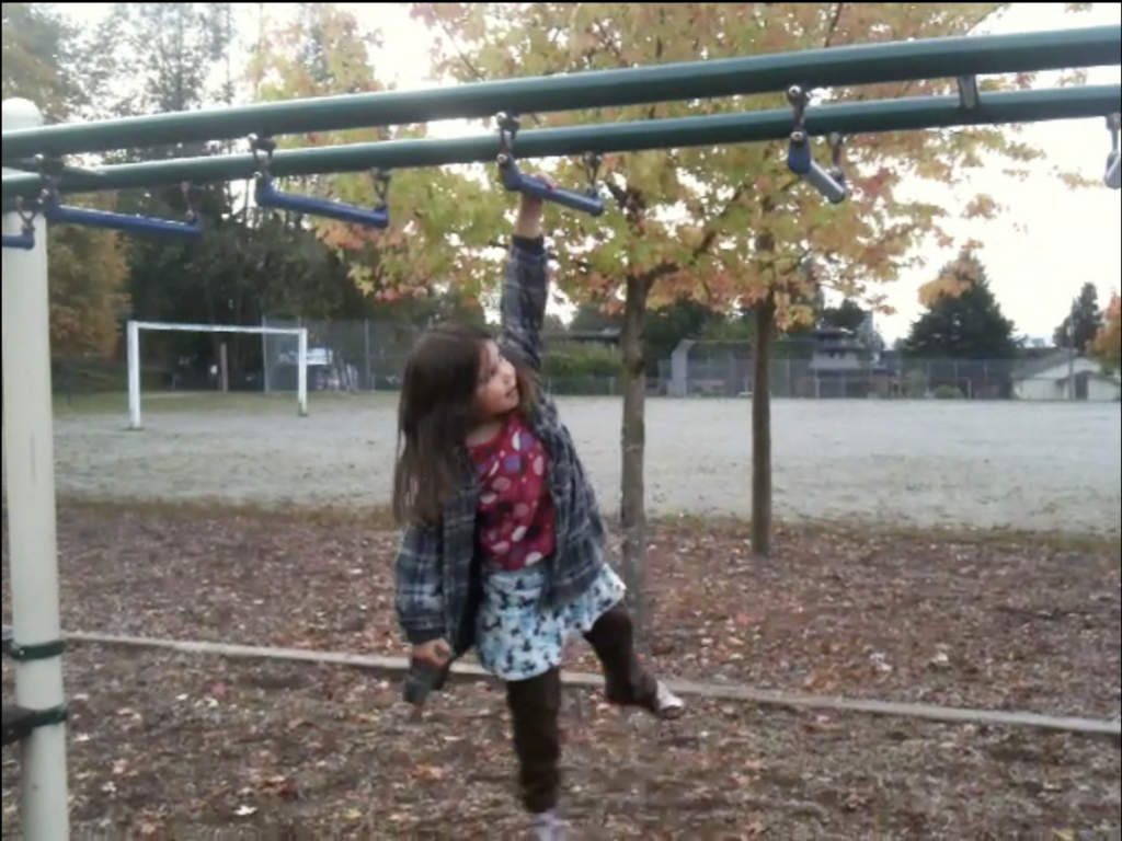
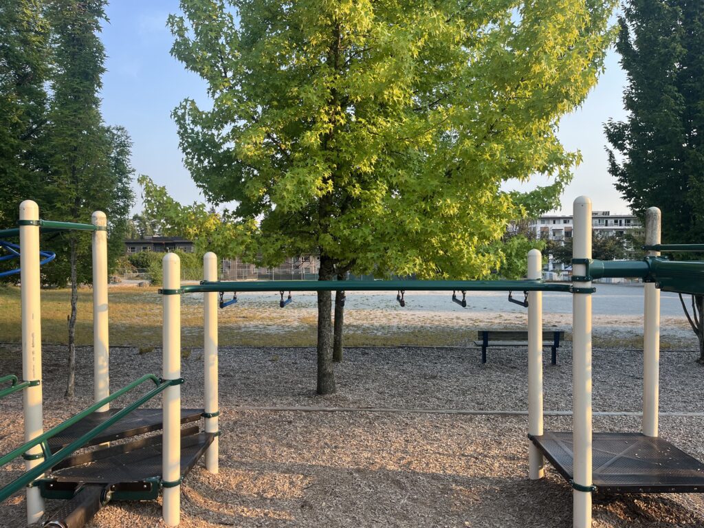
I changed some things in the painting’s composition compared to its actual nature. Firstly, I replaced the gravel field with grass. I thought that grass would add more depth and interest to the painting as well as capture the flourishing feeling I was going for. I also decided to paint in two children playing with a ball in the background. This is a nod to my older brothers who could often be found playing soccer while I was swinging on the monkey bars.

While learning about the Space and Place theme, I was very interested in Claude Monet’s painting, “The Thames at Westminster”. I like the colour palette of the painting. It feels very cohesive and calming. I also really like the different elements that can be uncovered in the distance.

While I was inspired by the opportunity to use collage, I had concerns about how to make sure it enhanced the composition of my painting. First, I had to decide where to use it and how much. I didn’t want the collage to take up too much of the painting because acrylic paint was my main medium. I decided to use it in a few places in the background, then again for the focal point of the painting. I also had to decide whether or not to simply paste the pictures on or try to blend them in. I matched the compositions up the best I could, but I thought it would be best to use paint to really make the pictures a part of my piece. I was also worried about mixing colours to match the pictures, and making sure that the colours from the pictures and the rest of my painting were cohesive. In the end, I think the pictures matched very well to the colours I mixed, and I think choosing to blend in the pictures helped.

My Painting Progress and Growth in this Course

My view of painting has changed from thinking that it is something difficult and stressful to a relaxing and enriching experience. Before starting this course, I was very intimidated because when I thought of painting, I thought of the amazing pieces you might find in a museum or a gallery. After practicing techniques, exercising my creativity, and learning about painting genres, I know that painting is for everyone, regardless of experience or skill. I have definitely enjoyed improving upon my painting skills and learning more so that I am more informed in the future when I pick up a paintbrush.

My main growth these past few weeks has been through the practice of techniques and exploration of art theories. There are so many things that I notice in paintings, like value, composition, and contrast, that I never thought of critically until I had the opportunity to play around with them in my own pieces. Once again, the opportunity to practice painting techniques and work towards a theme or meaning in my pieces was what helped me grow the most and gave me confidence in my painting skills.
Project 1: Autobiographical Still Life Painting

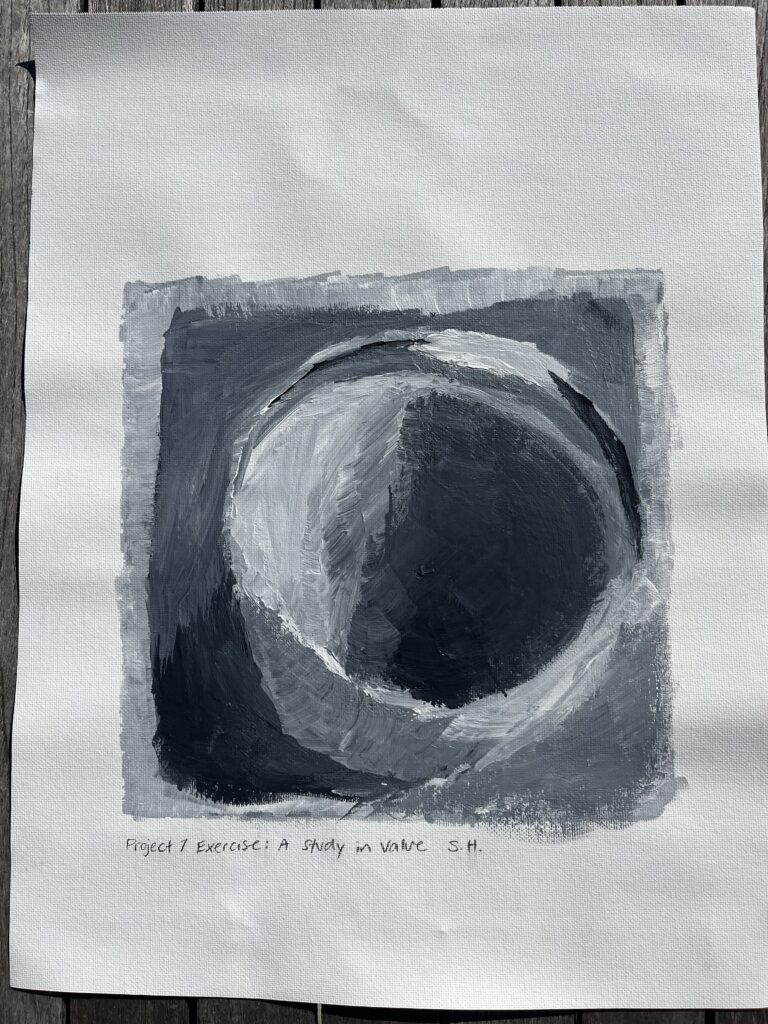
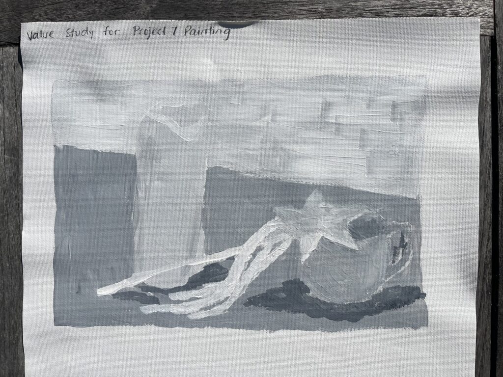
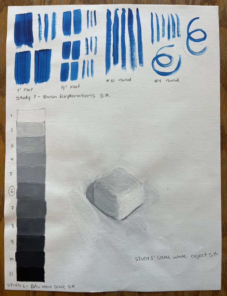
Project 1 Exercise: A Study in Value

My Study in Value from Week 2

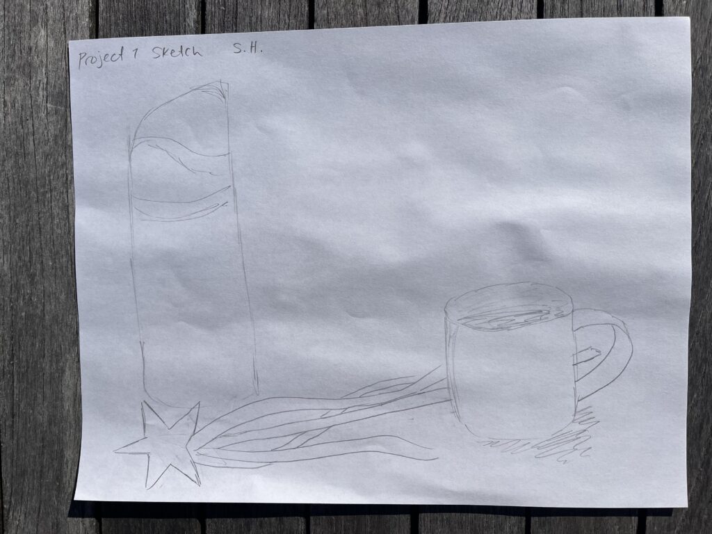
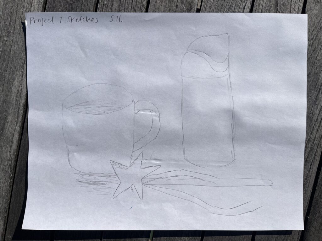
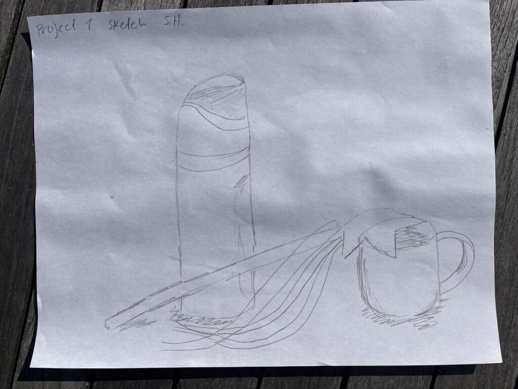
Project 1 Composition Sketches and Value Study

My chosen arrangement

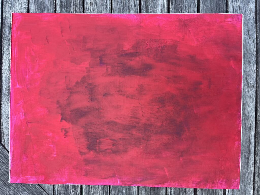
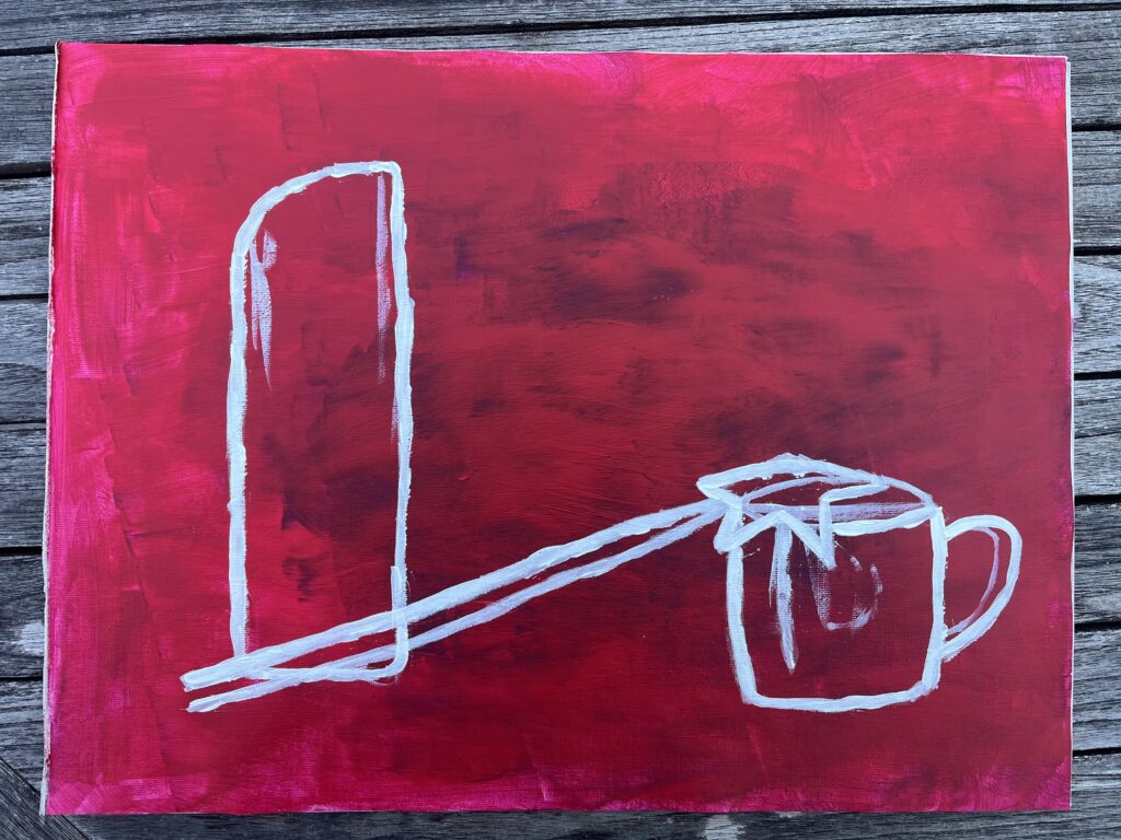
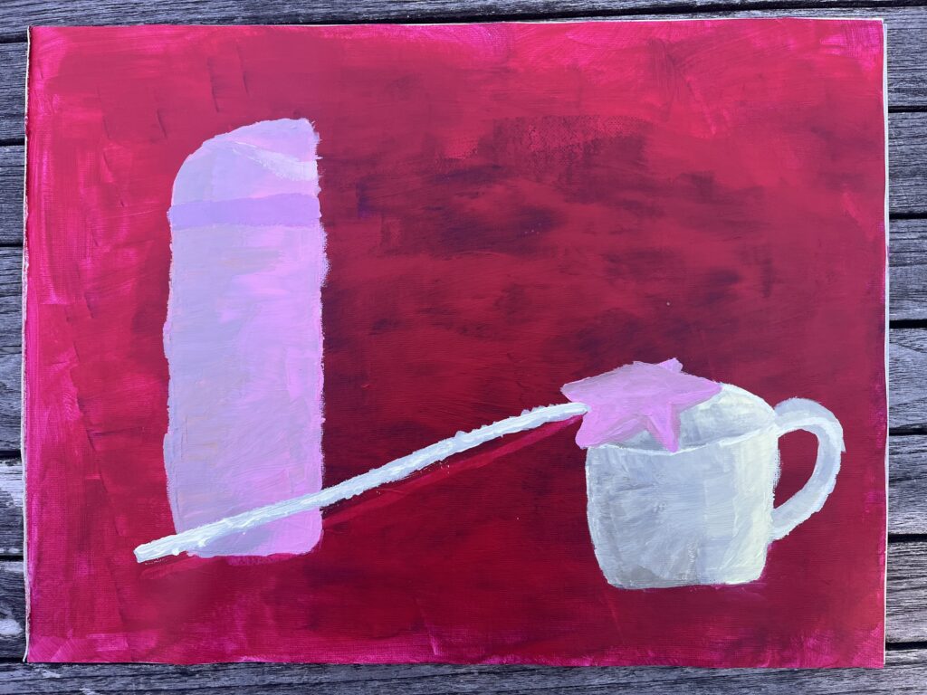
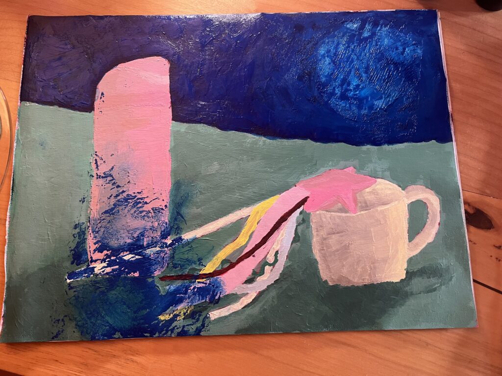
My Painting Progress

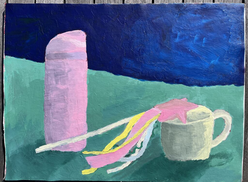
My Autobiographical Still-Life Painting

Painted on a 12″x16″ Canvas Pad

My Written Rationale

The objects that I chose for this assignment were my water bottle, my favourite mug, and a crafted fairy wand that I made. I had a difficult time picking objects that were within my scope as a beginner, but also that had personal significance to me. Although my objects are simpler, I feel they represent me and my interests. The water bottle is one that I use every day and take with me wherever I go. It’s also my favourite colour, a perfect light pink. The mug is my go-to cup when I’m at home. There isn’t much that is special about it, but I really love it. It’s practical, strong, and it holds the perfect amount of tea, water, or juice. The fairy wand is special to me because I made it as an activity with my friends. I have always loved creating things using textiles, beads, and other assorted things from around the house. I feel that the wand represents my whimsical nature and my love of crafting. For the background of the painting, I chose a dark blue and a teal. As I painted my objects, I found that they were more in the mid and light tones, so I wanted the background to be darker to create more contrast and make the painting more interesting as a whole.

This assignment allowed me to learn more about still life in general. I had heard the term before, but I never knew what it consisted of as a genre. I learned that still life is a genre of painting that usually involves painting groupings of everyday objects, focusing on stationary objects. Once I knew more about the genre, I was interested in looking into different paintings that are considered still-life and to see how different they can be while still meeting the basic requirements of the genre. Additionally, once I got started on painting the background, I became more interested in what other artists choose to paint for their backgrounds. It was helpful to see what choices they made and how their chosen backgrounds add to the painting overall.

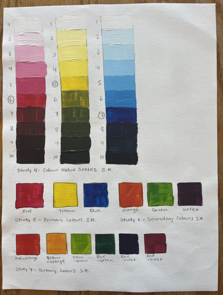
I enjoyed the ups and downs of my painting progress, but there were certainly frustrating moments. Firstly, I struggled with adding form to my objects. I found the black and white value exercises helpful, but when I had to add different values to my coloured objects, I struggled with getting it right. After rewatching the course videos, I learned that to avoid a dull shadow, you can mix a chroma, and that you don’t need to use black at all. Once I started mixing chromas, I found the process of adding shadows much easier. Secondly, I went back and forth on what to paint as the background. I thought that my objects were all in the mid/light tones, so I wanted to make a background that would contrast those light values, and that would serve as a complement to the pink colours from the water bottle and the wand. I started with a dark violet for the top section of the background, but it didn’t look right. Instead, I painted the top section dark blue. I knew that I wanted to paint the bottom section/table top teal. I think that colour works well as a complement to the pink and yellow colours in the painting. I still feel that something could be different in the background, but I’m glad that I went out of my comfort zone and picked something that would stand out, as opposed to adding mid-tone neutrals. Finally, there are a few things that I would do differently next time, mainly having to do with the overall colour profile and arrangement of the objects. I feel that I could have added more complementary or analogous colours to make the painting feel more full, and I wish I had chosen an object arrangement that created more depth in the painting.

A Painting Mishap

When I was done painting the dark blue portion of my background, I held it up to look at it and my canvas pad folded onto itself. I had a big blue patch on the bottom left corner of my painting, so I had to redo that area. I was frustrated at the thought of having to redo that corner of the painting, but it allowed me to go back and add more shadows and darker values to my objects. Although it was annoying to have to re-mix the colours, I am actually happier with how the form and shadows turned out. I also learned to be extra careful with my canvas pad in the future, especially when the paint is not fully dry!

Final Thoughts

Overall, I enjoyed the process of painting a still life, and I feel that I learned a lot about painting through experience. I now feel more confident about creating form on coloured objects and mixing colours. In addition, I appreciate being able to follow the provided 10-step process. It removed some of the intimidation of creating a whole painting as a beginner. I will definitely look back at this process in the future!

© 2026 Sofia's Blog

Theme by Anders NorenUp ↑