Project 1 Exercise: A Study in Value
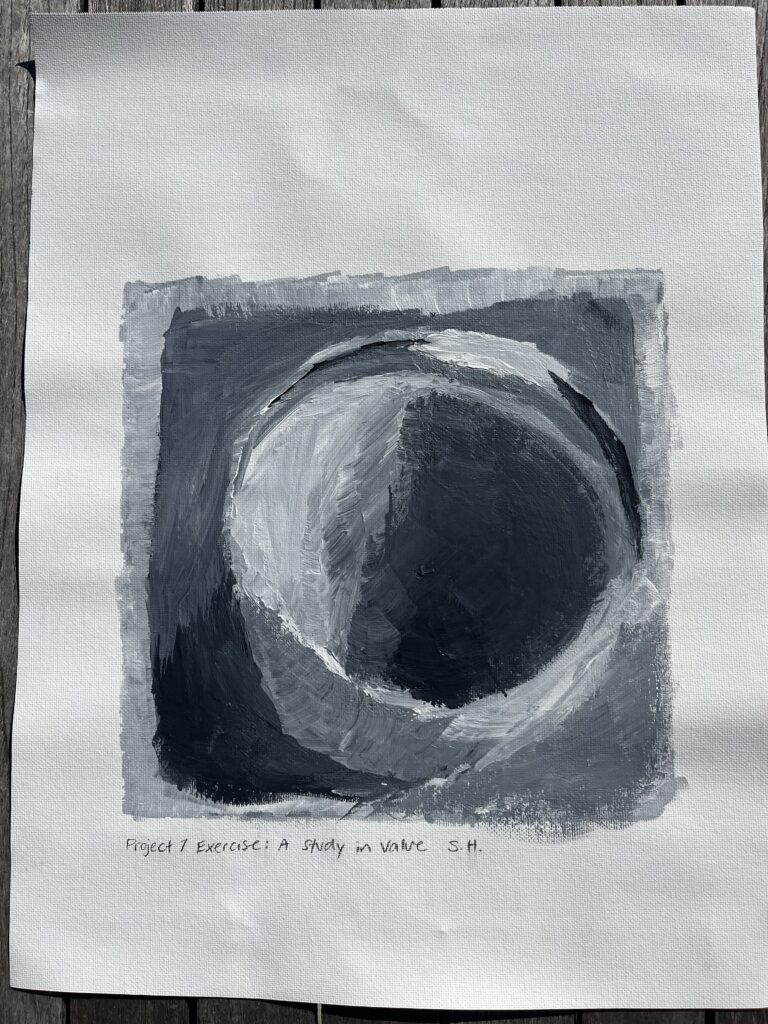
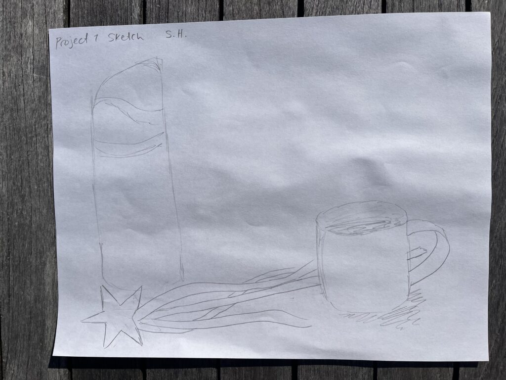
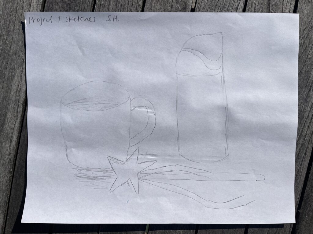
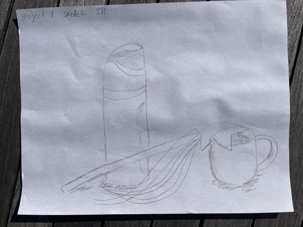
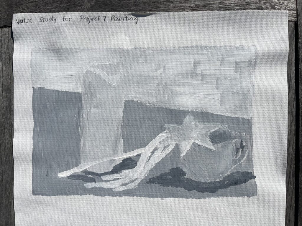
Project 1 Composition Sketches and Value Study
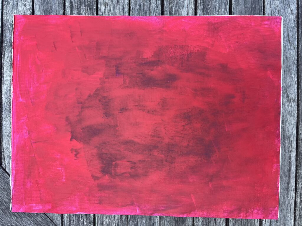
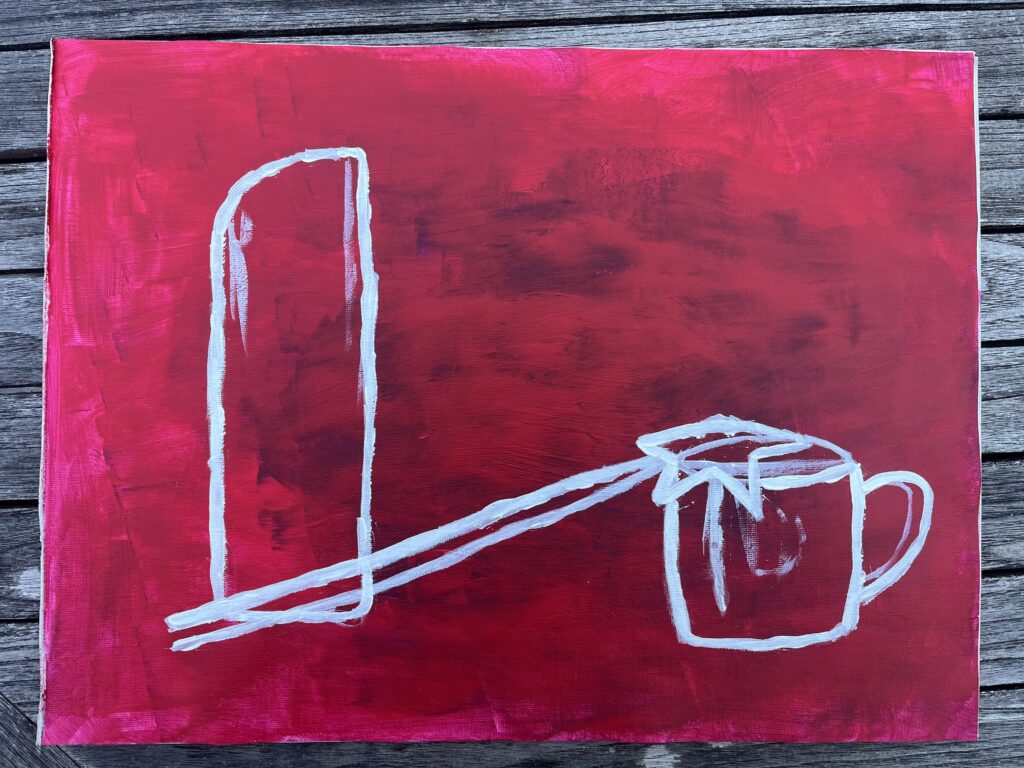
My Painting Progress
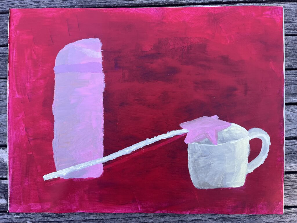
My Autobiographical Still-Life Painting
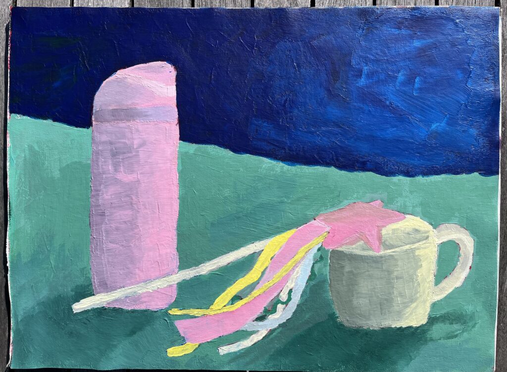
My Written Rationale
The objects that I chose for this assignment were my water bottle, my favourite mug, and a crafted fairy wand that I made. I had a difficult time picking objects that were within my scope as a beginner, but also that had personal significance to me. Although my objects are simpler, I feel they represent me and my interests. The water bottle is one that I use every day and take with me wherever I go. It’s also my favourite colour, a perfect light pink. The mug is my go-to cup when I’m at home. There isn’t much that is special about it, but I really love it. It’s practical, strong, and it holds the perfect amount of tea, water, or juice. The fairy wand is special to me because I made it as an activity with my friends. I have always loved creating things using textiles, beads, and other assorted things from around the house. I feel that the wand represents my whimsical nature and my love of crafting. For the background of the painting, I chose a dark blue and a teal. As I painted my objects, I found that they were more in the mid and light tones, so I wanted the background to be darker to create more contrast and make the painting more interesting as a whole.
This assignment allowed me to learn more about still life in general. I had heard the term before, but I never knew what it consisted of as a genre. I learned that still life is a genre of painting that usually involves painting groupings of everyday objects, focusing on stationary objects. Once I knew more about the genre, I was interested in looking into different paintings that are considered still-life and to see how different they can be while still meeting the basic requirements of the genre. Additionally, once I got started on painting the background, I became more interested in what other artists choose to paint for their backgrounds. It was helpful to see what choices they made and how their chosen backgrounds add to the painting overall.
I enjoyed the ups and downs of my painting progress, but there were certainly frustrating moments. Firstly, I struggled with adding form to my objects. I found the black and white value exercises helpful, but when I had to add different values to my coloured objects, I struggled with getting it right. After rewatching the course videos, I learned that to avoid a dull shadow, you can mix a chroma, and that you don’t need to use black at all. Once I started mixing chromas, I found the process of adding shadows much easier. Secondly, I went back and forth on what to paint as the background. I thought that my objects were all in the mid/light tones, so I wanted to make a background that would contrast those light values, and that would serve as a complement to the pink colours from the water bottle and the wand. I started with a dark violet for the top section of the background, but it didn’t look right. Instead, I painted the top section dark blue. I knew that I wanted to paint the bottom section/table top teal. I think that colour works well as a complement to the pink and yellow colours in the painting. I still feel that something could be different in the background, but I’m glad that I went out of my comfort zone and picked something that would stand out, as opposed to adding mid-tone neutrals. Finally, there are a few things that I would do differently next time, mainly having to do with the overall colour profile and arrangement of the objects. I feel that I could have added more complementary or analogous colours to make the painting feel more full, and I wish I had chosen an object arrangement that created more depth in the painting.
A Painting Mishap
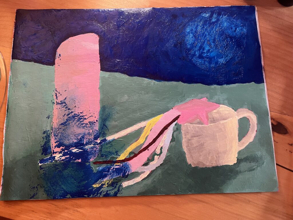
When I was done painting the dark blue portion of my background, I held it up to look at it and my canvas pad folded onto itself. I had a big blue patch on the bottom left corner of my painting, so I had to redo that area. I was frustrated at the thought of having to redo that corner of the painting, but it allowed me to go back and add more shadows and darker values to my objects. Although it was annoying to have to re-mix the colours, I am actually happier with how the form and shadows turned out. I also learned to be extra careful with my canvas pad in the future, especially when the paint is not fully dry!
Final Thoughts
Overall, I enjoyed the process of painting a still life, and I feel that I learned a lot about painting through experience. I now feel more confident about creating form on coloured objects and mixing colours. In addition, I appreciate being able to follow the provided 10-step process. It removed some of the intimidation of creating a whole painting as a beginner. I will definitely look back at this process in the future!